
Custom Lapel Pins for Corporate Branding, Employee Recognition, and Events
Custom lapel pins are a versatile way for businesses and organizations to display their identity, recognize achievements, and create memorable event keepsakes. With customized logos, colors, shapes, and finishes, lapel pins can serve as employee appreciation gifts, corporate promotional items, membership symbols, or branded souvenirs.
The best design depends on how the pins will be used. Corporate branding usually calls for consistent logo reproduction, employee recognition benefits from meaningful symbols or messages, and event pins often focus on a specific theme, date, or occasion. Choosing the right materials, pin style, and backing helps ensure the finished product fits its purpose.
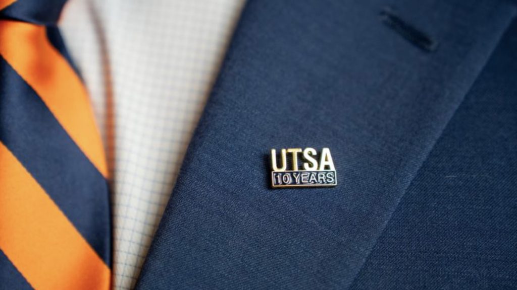
How Businesses Use Custom Lapel Pins
Custom lapel pins can support different business goals without requiring a completely different product for every occasion.
Corporate branding
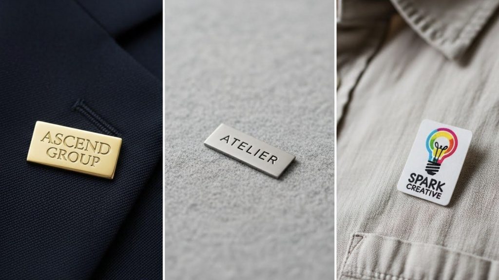
Companies can use logo pins at trade shows, conferences, client meetings, and networking events. Employees may wear them on suits, uniforms, jackets, or bags, helping create a consistent brand presence. For these applications, a recognizable logo, suitable color matching, and a professional finish are important.
Employee recognition
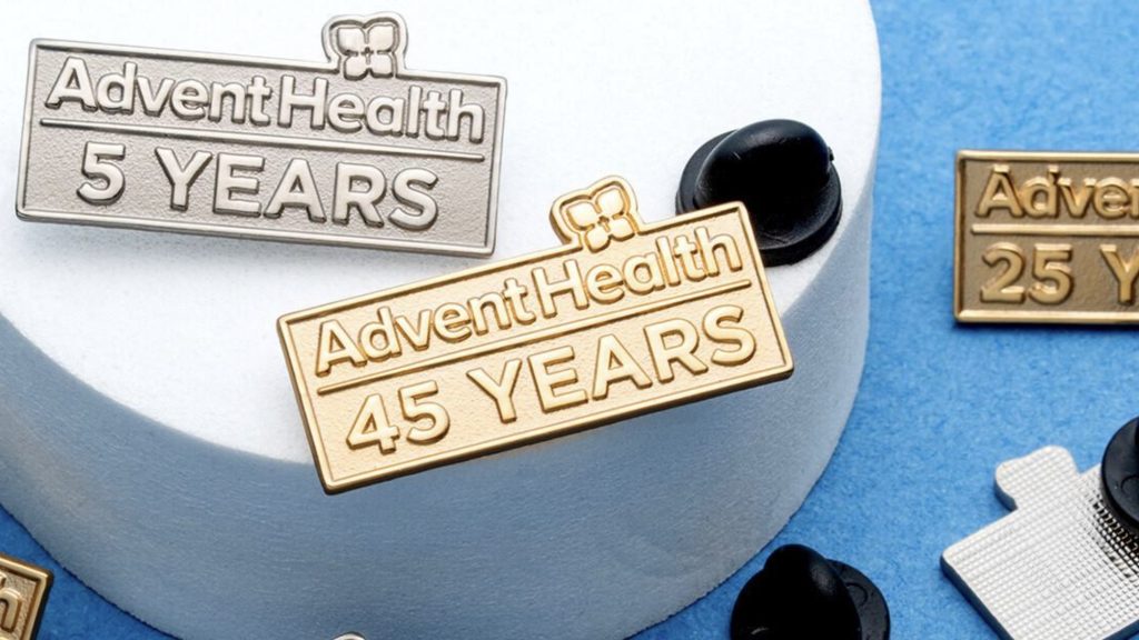
Pins can mark work anniversaries, outstanding performance, team achievements, promotions, or years of service. A design might include a company logo, an achievement symbol, or a short message. Creating different versions for different milestones can make the recognition program easier to maintain over time.
Events and corporate gatherings
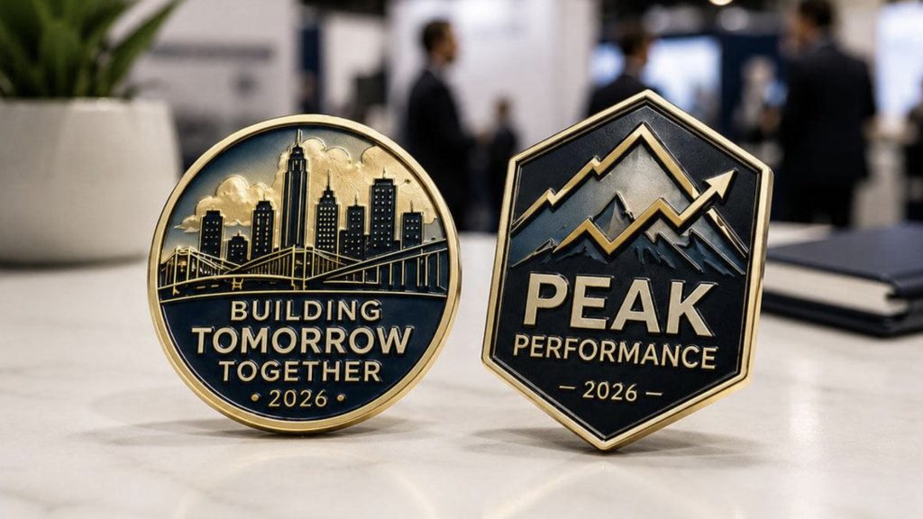
Product launches, company anniversaries, award ceremonies, charity fundraisers, and annual meetings are all opportunities to create event-specific pins. Adding an event name, date, or themed graphic turns a standard promotional item into a keepsake that participants can associate with a particular experience.
Which Lapel Pin Style Is Best for Your Project?
The right style depends on the artwork, budget, desired appearance, and intended use. Not every design needs the same production technique.
| Pin style | Main characteristics | Suitable applications |
|---|---|---|
| Soft enamel | Recessed colored areas with raised metal lines | Colorful company logos, team pins, promotional giveaways |
| Hard enamel | Smooth, polished surface with a more uniform finish | Corporate gifts, formal recognition, premium-looking pins |
| Die-struck | Raised and recessed metal details without enamel color | Minimalist logos, anniversary pins, classic designs |
| Printed | Printed artwork allows fine details and color gradients | Complex graphics, small text, detailed illustrations |
These are general guidelines rather than strict rules. The best option depends on the design itself. A simple one-color logo may work well as a die-struck pin, while artwork with several distinct colors may be better suited to an enamel or printed design.
Before choosing a style, consider how the pin will look at its actual size. Very small text, thin lines, and intricate details may need to be simplified to remain recognizable.
How to Design Lapel Pins for Different Business Goals
A successful custom pin starts with a clear purpose. Instead of putting every available element into one design, prioritize the details that matter most to the intended audience.
For corporate branding, keep the company logo prominent and use brand colors consistently. A simple design is often easier to recognize from a distance and works well across different types of clothing.
For employee recognition, consider adding a milestone year, achievement icon, department name, or short phrase. The design should feel meaningful without becoming crowded. If pins will be awarded at different career milestones, a consistent visual system can help distinguish each level.
For events, include the details that make the occasion unique. An event name, date, location, or themed illustration can give the pin lasting value. When pins are intended as souvenirs, a more distinctive shape or decorative edge may be worth considering.
In all three cases, prepare clear artwork before production. Vector artwork is generally useful for logos and clean outlines, while high-resolution images may be needed for printed designs. Review the proposed dimensions, colors, lettering, and metal finish before approving the final artwork.
What to Consider Before Ordering Custom Lapel Pins
Once the design direction is clear, several practical details can affect the final result.
Size and shape: Choose dimensions that preserve the important details without making the pin inconvenient to wear.
Material and finish: Discuss the available metal options and finishes with your manufacturer. Polished, antique, and darker metallic finishes can create different visual effects.
Backing attachment: Butterfly clutches are common for general-purpose pins. Rubber clutches and other attachment options may suit different preferences or applications.
Quantity and budget: Establish the required quantity and target budget early so the manufacturer can recommend suitable production options.
Packaging: Individual bags, backing cards, or gift boxes can make pins easier to distribute at events or present as employee recognition gifts.
Artwork approval and quality checks: Confirm the logo, colors, dimensions, attachment, and finish before approving production. For larger orders, clarify how the finished items will be checked against the approved design.
Sharing the intended use, approximate size, artwork, quantity, and delivery requirements with your manufacturer makes it easier to evaluate suitable options and avoid unnecessary design revisions.
Custom Lapel Pins from Green Tree Gifts
Green Tree Gifts is a China-based manufacturer specializing in custom metal gifts, including lapel pins, challenge coins, medals, badges, and other promotional products. For corporate branding, employee recognition programs, and event merchandise, the design and production details can be discussed according to the project’s requirements.
When requesting a quote, prepare your logo or reference artwork, preferred dimensions, quantity, finish, and intended application. If you are unsure which pin style is appropriate, explain how the pins will be used so the available options can be evaluated before production.
Frequently Asked Questions
Are custom lapel pins suitable for employee recognition?
Yes. They can mark service anniversaries, achievements, promotions, and team milestones. Customized symbols or dates can make each pin more meaningful.
Which lapel pin style is best for corporate logos?
Soft enamel, hard enamel, die-struck, and printed pins can all work. The best choice depends on the logo’s colors, detail level, and desired finish.
Can custom lapel pins be used as event giveaways?
Yes. Event-specific artwork, dates, and themes can turn lapel pins into branded giveaways or keepsakes for conferences, launches, and company celebrations.
What information should I provide when requesting a quote?
Provide the artwork, preferred size, quantity, pin style if known, finish, backing, and delivery requirements. These details help the manufacturer assess your project.
Planning custom lapel pins for your company or next event? Request a custom quote from Green Tree Gifts.
Explore more from Green Tree Gifts: Custom Lapel Pins | Custom Challenge Coins | Patches | Contact Us